In the previous post, we saw why we should be interested in Principal Component Analysis. In this post, we will do a deep dive and get to know how this is implemented.
Now that you have some idea about how to change higher dimensions to lower dimensions, we will go through the below description which is shown in a jupyter notebook.
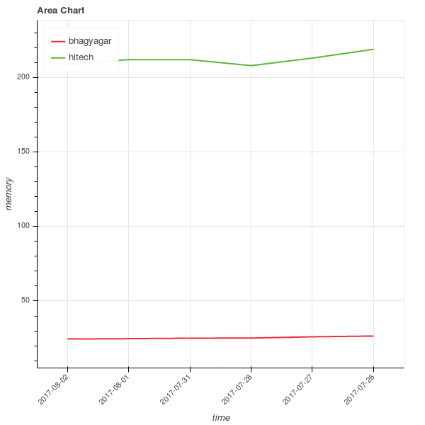
I have downloaded the data of three companies that are in the Indian stock market from Quandl. We will try to understand the Indian ecosystem using this.
These data are for the Hitech Corporation Ltd. Housing and Development Corporation Ltd. and Bhagyanagar India limited. The features of the data set are Date, Open pricing, the maximum price reached during the day, minimum price during the day, last price before closing, closing price, total traded quantity and turn over in lakhs.
In order to load the data set, we will use the pandas library. If you are interested, in the dataset, you can create an account on the website which is free and download the data sets.

Taking a look at the shape of the matrices.
((51, 8), (55, 8), (53, 8))
So our three data sets are three matrices of dimensions (48 x 8), (52 x 8) and (50 x 8) where the columns are the different features and every row represents a separate data sample.
Visualization
To get the feeling of how the different stocks are distributed along opening stock prices and total trade quantities, let us visualize them using histograms.
Get the relevant data. Right now we are only interested in visualization and as we cannot show all the features in a plot, we will just focus on some specific columns.
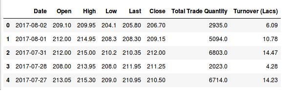
[array([‘2017-08-02’, 209.1, 2935.0], dtype=object), array([‘2017-08-01’, 212.0, 5094.0], dtype=object), array([‘2017-07-31’, 212.0, 6803.0], dtype=object), array([‘2017-07-28’, 208.0, 2023.0], dtype=object), array([‘2017-07-27’, 213.05, 6714.0], dtype=object), array([‘2017-07-26’, 218.95, 3389.0], dtype=object)]
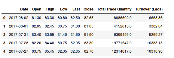
[array([‘2017-08-02’, 24.5, 5857.0], dtype=object), array([‘2017-08-01’, 24.75, 12622.0], dtype=object), array([‘2017-07-31’, 25.05, 31276.0], dtype=object), array([‘2017-07-28’, 25.15, 11483.0], dtype=object), array([‘2017-07-27’, 26.0, 19290.0], dtype=object), array([‘2017-07-26’, 26.5, 17808.0], dtype=object)]
Show how the data is distributed for one company.
Standardizing
We want to compare oranges to oranges and apples to apples. Generally, we are more interested in how the changes are happening and not too much concerned about the scale on which the data set was published. In this case, you can see the data set is comprised of numbers that were gathered on various scales, so it would be wise to standardize the data set to the unit scale with mean as 0 and variance as 1.
(159, 7)
Covariance matrix
We can perform the Eigen decomposition on the covariance matrix.
In terms of code, this can be represented using the below format.
Please note that the shape of the standardized matrix is 150 x 7. So we should get a covariance matrix of 7 x 7.
Covariance matrix
[[ 1.00632911 1.00550536 1.00597911 1.00542205 1.00545316 -0.06315605
-0.05901863]
[ 1.00550536 1.00632911 1.00541311 1.00598897 1.00602285 -0.0542054
-0.0497978 ]
[ 1.00597911 1.00541311 1.00632911 1.00562847 1.00565687 -0.06570958
-0.06198619]
[ 1.00542205 1.00598897 1.00562847 1.00632911 1.00628689 -0.06051605
-0.05646143]
[ 1.00545316 1.00602285 1.00565687 1.00628689 1.00632911 -0.05997139
-0.05587568]
[-0.06315605 -0.0542054 -0.06570958 -0.06051605 -0.05997139 1.00632911
0.99963087]
[-0.05901863 -0.0497978 -0.06198619 -0.05646143 -0.05587568 0.99963087
1.00632911]]
Covariance matrix shape is: (7, 7)
We showed the code just to show how the covariance works. In general, the cov function is used.
[[ 1.00632911 1.00550536 1.00597911 1.00542205 1.00545316 -0.06315605
-0.05901863]
[ 1.00550536 1.00632911 1.00541311 1.00598897 1.00602285 -0.0542054
-0.0497978 ]
[ 1.00597911 1.00541311 1.00632911 1.00562847 1.00565687 -0.06570958
-0.06198619]
[ 1.00542205 1.00598897 1.00562847 1.00632911 1.00628689 -0.06051605
-0.05646143]
[ 1.00545316 1.00602285 1.00565687 1.00628689 1.00632911 -0.05997139
-0.05587568]
[-0.06315605 -0.0542054 -0.06570958 -0.06051605 -0.05997139 1.00632911
0.99963087]
[-0.05901863 -0.0497978 -0.06198619 -0.05646143 -0.05587568 0.99963087
1.00632911]]
Next is to perform an eigen decomposition on the above matrix. Eigen decomposition is the method where we decompose a square matrix into its Eigen vectors and Eigen values. The Eigen vectors are basically hyperplanes to which the data gets projected into. Take a look at wikipedia to learn more.
We find the Eigen vectors and the Eigen values using the numpy library. In PCA the Eigen vectors are called loadings. Let’s call them the matrix W.
[ 5.04062300e+00 1.99469506e+00 6.70989466e-03 1.52221819e-03
5.08344416e-04 2.04592597e-04 4.06913481e-05]
[[-0.44636953 -0.0255697 -0.00233638 0.61091357 0.39241169 -0.52200819
0.02000256]
[-0.44626454 -0.03201096 -0.03801748 -0.31356635 0.66065443 0.51116882
-0.04791904]
[-0.44644488 -0.02362002 0.04386902 0.47716468 -0.50791923 0.55804311
-0.03353175]
[-0.44641063 -0.02742468 0.0018537 -0.3959805 -0.28922772 -0.3236239
-0.67437107]
[-0.44640923 -0.02782594 -0.0024592 -0.37808739 -0.25605417 -0.22367243
0.73579569]
[ 0.04405545 -0.70563431 0.70623273 -0.01919751 0.03123937 -0.00518154
0.0018351 ]
[ 0.04224484 -0.705916 -0.70558526 0.02560183 -0.03707468 0.00362514
-0.00206853]]
To know why the Eigen values and Eigen vectors are important, take a look at the math below. If this sounds too heady, you can skip this section and just focus on the code.
So, we know that after performing the Eigen decomposition we get the Eigen values and the Eigen vectors. Let’s call them λ and W. Therefore, in terms of principal component analysis, we will say that the scores are the product of matrices X and W, i.e.,
assuming T is the score.
Singular Value Decomposition
Finding the Eigen values and Eigen vectors are computationally not the most efficient way of finding the loadings or the matrix W. We have a shortcut to do the same thing and that is through Singular Value Decomposition or SVD.
How it works is that the same input matrix X can be broken down to three matrices U, Σ, and V*.
Let us call this equation 1.
U is the left singular vector and V* is the right singular vector. So Σ will contain singular values in its diagonal and they are ordered. Please note that although V* means conjugate of V. Since we will be dealing with real world data, you can think of this as the transpose of V.
Now, interestingly the matrix V turns out to be identical to the loadings or W.
How is this transformation beneficial to us. Let’s explore that below. We know that the scores T can be shown with the given equation
Coming from equation 1 above we can write –
Since V*V is the Identity Matrix, and W is the same as V, we get
So we can find the scores if we can compute U and Σ, which can be easily done. If you are interested in trying this right away, take a look at this SVD computation example.
Selecting Principal Components
Now we will select the principal components. This is mostly based on human judgment but many thumb rules can be followed. Understanding of how many components you incorporate will ultimately come through experience and experimentation.
Right now with the help of the Eigen decomposition we transformed our data to the new set of planes with the eigen vectors as the axes.
We need to decide which Eigen vectors can be dropped without losing too much information. Please note that the Eigen values with the least amount of value are the ones that have the least amount of information regarding the data distribution. Why is that so? Remember the definition of Eigen vectors and Eigen values.
The eigen value λ is the amount the vectors elongate or shrink. So, if the value of λ is small that would mean that the effect ν has on matrix A will be small.
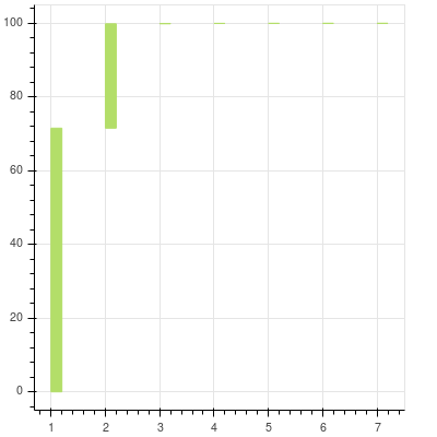
We will try to see how much each value contributes to the overall variance.
We will try to see how much each value contributes to the overall variance.
[71.556013843924504, 99.872439612636256, 99.967692385037282, 99.989301591992117, 99.996517981727536, 99.999422351033218, 99.999999999999986]
7
[0, 71.556013843924504, 99.872439612636256, 99.967692385037282, 99.989301591992117, 99.996517981727536, 99.999422351033218]
7
[0, 2, 4, 6, 8, 10, 12]
[1, 3, 5, 7, 9, 11, 13]
You can see that after the first two components the contribution of the remaining to the total is almost nonexistent and cannot be seen at all. They are there and you can zoom in to see the others. The first two principal components can explain more than 99% of the data that we have.
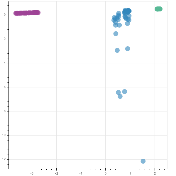
Now, since you know where the majority of the data in your data set is coming from it becomes obvious to trim those extra dimensions. Effectively we will construct a projection matrix to transform our data to a new feature subspace. In this case, we will trim all the other features and take into account only two features. So we are reducing our 7-dimensional feature space to 2-dimensional feature subspace. This is possible since we are only choosing the top 2 Eigen vectors with the highest Eigen values to construct our (150 x 2) Eigen vector matrix W.
[5.0406230005245538, 1.9946950557326693, 0.0067098946634397017, 0.0015222181861223813, 0.00050834441617230038, 0.00020459259729253709, 4.0691348102287684e-05]
https://gist.github.com/infinite-Joy/91177e07b9916e2f268e33a4154c6360/
[[-0.44636953 -0.0255697 ]
[-0.44626454 -0.03201096]
[-0.44644488 -0.02362002]
[-0.44641063 -0.02742468]
[-0.44640923 -0.02782594]
[ 0.04405545 -0.70563431]
[ 0.04224484 -0.705916 ]]
Dimensionality Reduction
Using this new loading matrix W, we can reduce the dimensions of the original matrix X. This can be done using the matrix multiplication property, whereby if you multiply two matrices of dimensions (m x n) and (n x p), you get a new matrix of dimensions (m x p). So, in this case, we multiply matrix X, which is (159 x 7) and matrix W, which is (7 x 2) to get a new matrix (159 x 2).
Taking a look at the code below.
array([[-3.12570525, 0.1778062 ],
[-3.22460186, 0.17146108],
[-3.26460636, 0.16888734],
[-3.227314 , 0.17157395]])
If you remember, the shapes of hitech, bhagyanagar and hudco were (51, 8), (55, 8), (53, 8). Hence, to create the mappings, we create a Z vector/list with shape (159, 1).
https://gist.github.com/infinite-Joy/infinite-Joy/446130b2e02e914359ecca1e5610916d
You can see that two companies are very tightly packed, saying that there is not much variation in them while the third company has a lot of variation. This company has had a rocky year.
In production
The code that is shown above is mainly for learning purposes. In production, we will be using the inbuilt function from the sklearn library.
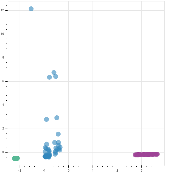
The graphs are opposite as the matrices are reversed in their sign. In case you are implementing this in production, you may not be finding the eigen values to understand if you are capturing the majority of the variance in the data set, as was done earlier. So, to find if your new feature subspace is capturing the intended amount of variance, you can use the explained_variance_ratio_ attribute.
[ 5.00892097 1.9821498 ]
[ 0.71556014 0.28316426]
0.99872439612636232
Generally, people see the explained variance ratios or keep a hard cutoff threshold of maybe 95%. In our case, the cumulative graph, generated by pca13.py was getting most of the variation and the inflection shoulder was quite steep. But even in cases where the shoulder is quite shallow, having such a cutoff will enable you to have a principled and consistent way to understand your data.
You can also download the whole blog as a jupyter notebook if you want to try out the code yourself.
Now that you know about Principal Component Analysis take a look at the decision systems around you, where data is the primary input and try to observe if they are using more data than necessary. If not, there is your gold mine.
References:
Siral Raval. Dimensionality Reduction. YouTube
Importance of Principal Component Analysis. Quora
Principal Component Analysis.Washington University.YouTube
Minimizing reconstruction error is equivalent to maximizing variance.Statistics StackExchange
Making sense of Eigen Vectors and Eigen Values and PCA – stats.stackexchange.com
plotly.Principal Component Analysis.